The comprehensive interface renewal that Google has been working on for a while for the Gemini application has been revealed in detail for the first time. This change, which affects almost all parts of the application, offers a different usage approach at many points, from the home screen to the chat experience. Among the innovations that attract attention at first glance are a simpler home screen layout and a more visually vibrant design language.
The most obvious change on the home screen is seen when the command entry area changes to capsule form. While there are voice input and Gemini Live options on the right side of this area, the rest is kept quite plain. The plus symbol next to this directs the user to a panel opened from the bottom section. In this panel, options such as accessing photos, opening the camera and viewing the latest images are presented in a scrollable structure. Files, notebooks and other upload options are located at the bottom of the panel.
The vehicles section also seems to have a more integrated structure. Options such as images, videos, music, Canvas, deep research and guided learning are listed with their descriptions. While Google is known to be testing this approach on both Android and the desktop web version, it is already available on the Mac side. This structure aims to provide ease of use by making different productive artificial intelligence functions accessible from a single point.
The welcome message has also changed in the new home screen layout. The user is now asked “Hello (name), what’s on your mind?” It is addressed as follows and this text is located in the middle of the screen. Along with the Gemini symbol located right above it, the colorful and animated gradient effect in the background attracts attention. This dynamic background strengthens the visual experience by becoming more visible, especially when a command is entered.
The design language and navigation structure are changing in the Gemini app
The design refresh is not limited to the home screen. The model selector has been moved to the upper left corner of the screen again and is now presented as a drop-down menu. In addition, the switch to thinner and rounded lines in the icons used creates a more modern appearance in the overall design language. On the navigation side, while the temporary chat start button comes to the fore, it is noteworthy that the account switcher menu has been moved to the bottom. This change takes a different approach than Google’s layout habits in its own applications.
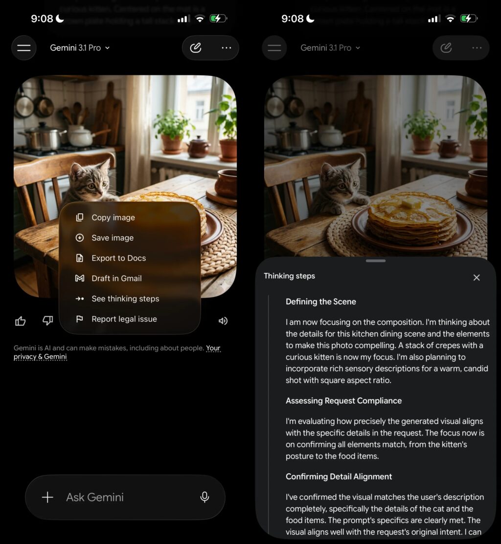
There are also some functional arrangements on the chat screen. The “See thinking steps” option is now in the overflow menu, not in the main view. When this option is accessed, the relevant process is shown on a panel that opens from the bottom of the screen. This ensures that the main chat flow remains simpler.
On the iOS side, this new design appears to make extensive use of Apple’s Liquid Glass design approach. This support, which was previously offered at a limited level, has become much more evident in the new design. Despite this, it is not yet clear how the same design will look in the Android version. For now, a small portion of iOS users can experience this renewed interface and the distribution process is progressing gradually.
In order not to miss the technology agenda, 📰 add it to Google News, 💬 join our WhatsApp channel, ▶ subscribe to YouTube, 📷 follow us on Instagram and 𝕏 X.